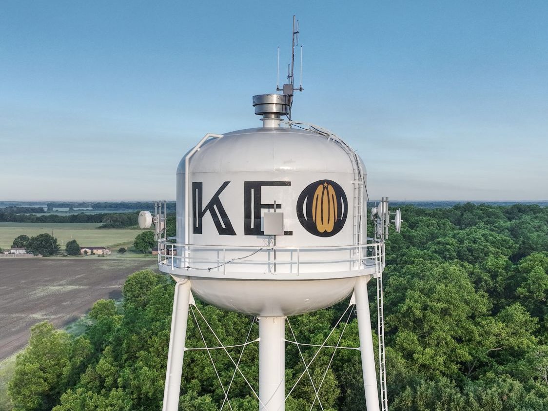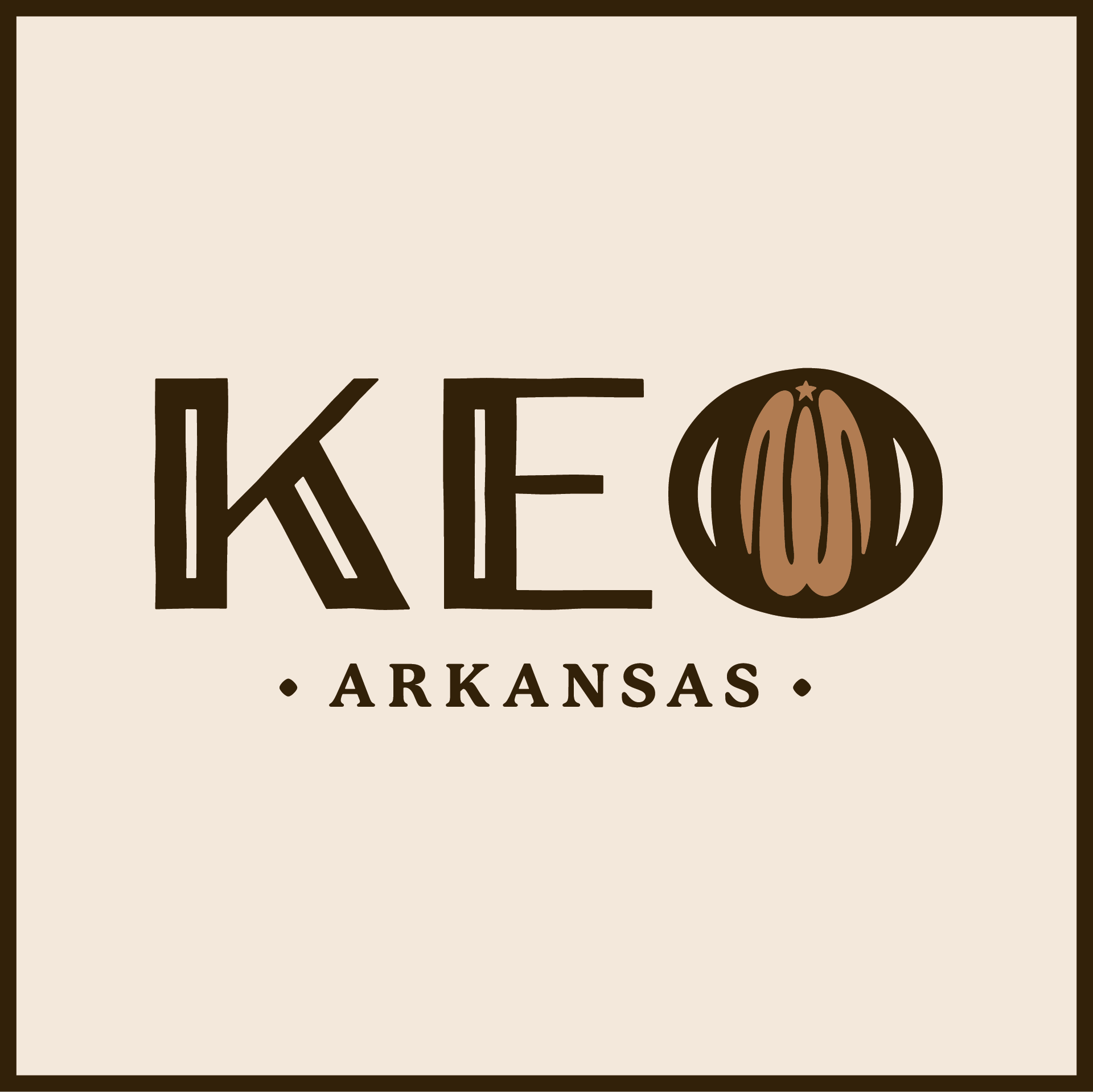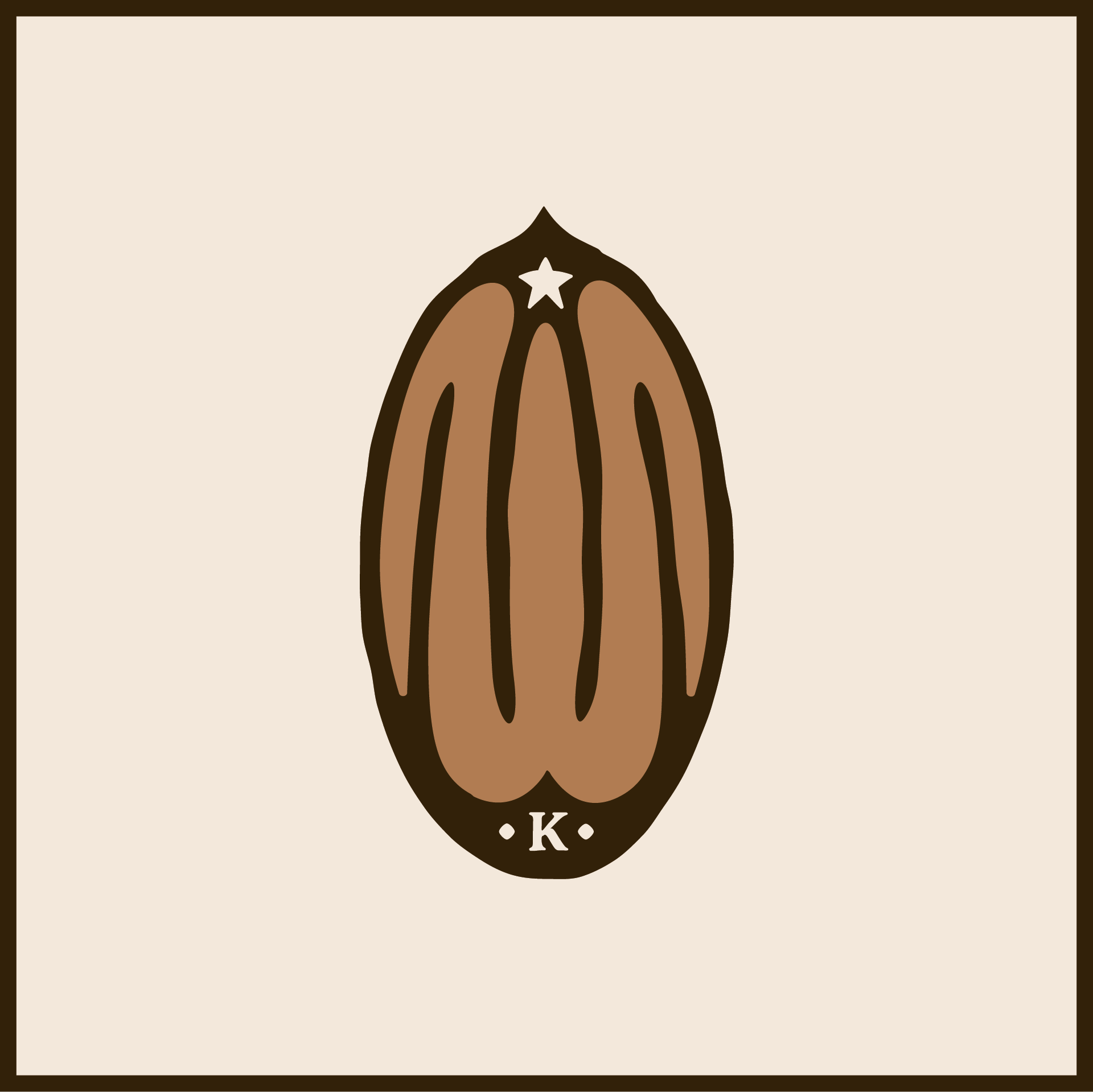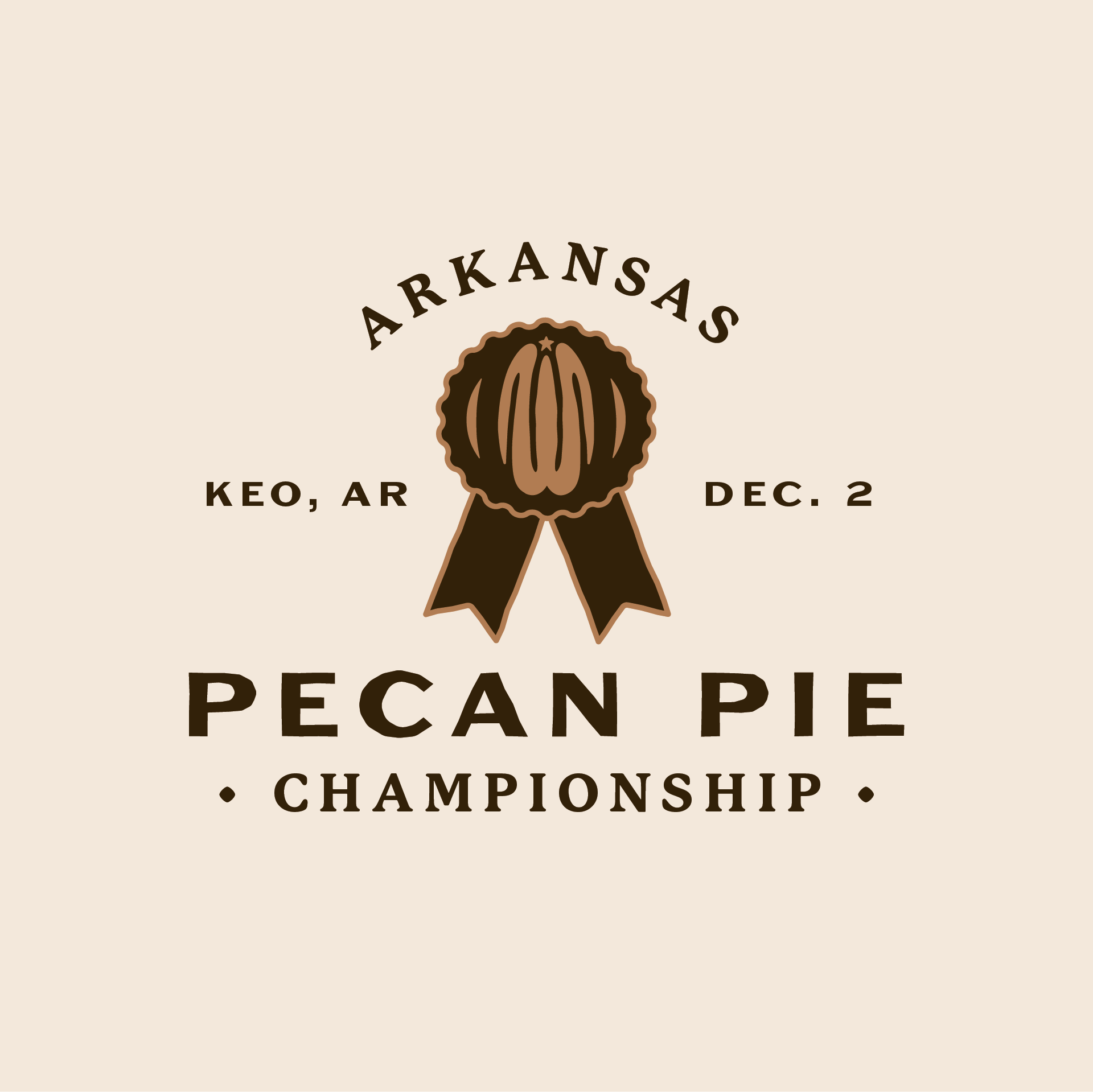
The pecan design sits within the name of the city itself, demonstrating its integral place in the community. The imprecise edges of the logo mimic the shape of the pecan and reflect the relaxed nature of the rural landscape. The colors and accompanying typography compliment these elements and communicate friendliness and history while still feeling contemporary. In addition to the primary logo, Thrive also developed a secondary logo to be used as shorthand and graphics for social media to announce the new identity and festival name.